Pareto Chart & Diagram: What It Is, Formula, Examples & Manufacturing Applications
How the Pareto principle helps manufacturing teams focus where it matters most.
A Pareto Chart helps manufacturing teams cut through the chaos when problems arrive in clusters—defects, delays, downtime, and customer complaints all competing for attention. With limited resources and time, how do you decide which fire to put out first?
A Pareto Chart is a decision-making tool that reveals which problems deserve immediate attention and which can wait. Based on the principle that roughly 80% of problems stem from 20% of causes, this visual tool transforms chaos into clarity. It shows manufacturing teams exactly where to focus their efforts for maximum impact.
Whether you call it a Pareto Chart, Pareto diagram, or Pareto analysis graph, this quality control tool serves the same purpose: helping you identify and prioritize the most impactful problems in your manufacturing process.
What is the Pareto Principle ?
The Pareto Principle, discovered by Italian economist Vilfredo Pareto in 1896, reveals a universal truth: imbalance is the norm, not the exception. Pareto originally observed that 80% of Italy's land belonged to 20% of the population. This same pattern appears everywhere in manufacturing.
Think about your own facility. Chances are, most of your headaches come from a handful of root causes. A few machines cause most breakdowns. A small number of suppliers create most delays. A limited set of defect types generate most customer complaints. The Pareto Chart makes these hidden patterns visible, turning intuition into actionable data.
If you prefer video, watch this quick explainer to understand the Pareto Principle:
Pareto Chart vs Pareto Diagram: What's the Difference?
You'll hear both terms used interchangeably in manufacturing—and they refer to the same tool. "Pareto Chart" is more common in North America, while "Pareto diagram" is frequently used in ISO standards and international quality documentation. Whether your team calls it a chart, diagram, or graph, the visualization combines bar charts with a cumulative line to reveal the vital few causes driving the majority of your problems.
Pareto Chart Formula
Creating a Pareto diagram involves a straightforward calculation process. Here's the step-by-step formula approach:
Step 1: Calculate Frequency or Impact
First, count how many times each problem occurs (or calculate the cost/impact of each problem type).
Frequency = Number of occurrences for each category
Step 2: Calculate Total
Add up all frequencies to get the total:
Total = Sum of all frequencies
Step 3: Calculate Individual Percentage
For each category, calculate what percentage it represents of the total:
Individual Percentage = (Category Frequency / Total) × 100
Step 4: Calculate Cumulative Percentage
Starting from the largest category, add percentages progressively:
Cumulative Percentage = Sum of all previous percentages + Current percentage
What Does a Pareto Chart Show?
A Pareto diagram combines the best of both worlds—the immediate clarity of a bar graph with the cumulative insight of a line graph. Here's what makes it powerful:
-
The Bars Tell the Story: Each vertical bar represents a problem category, arranged from tallest to shortest. The height shows frequency or impact. This simple arrangement immediately draws your eye to the biggest problems—no statistical knowledge required.
-
The Line Shows the Opportunity: The cumulative percentage line climbs from left to right, showing the combined impact of addressing each problem. When this line starts to flatten, you've found your "vital few"—the problems that, once solved, will transform your operation.
-
The Axes Frame the Decision: The left axis measures actual occurrences, the right shows cumulative percentage, and the horizontal axis lists your problem categories. Together, they create a complete picture that anyone can understand and act upon.
This visualization does something remarkable: it makes the invisible visible. Problems that seemed equally important suddenly reveal their true impact. The path forward becomes clear.
Pareto Real World Example
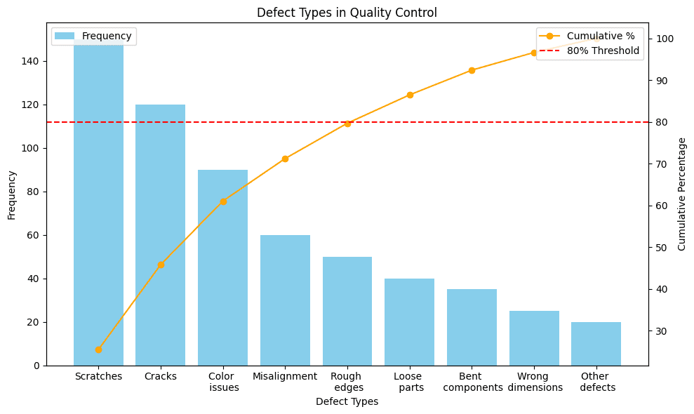
Look at this real Pareto diagram from a manufacturing facility. The bars show different types of defects found in one month, arranged from most common (scratches) to least common (other defects).
Here's the key insight: See where the orange line crosses the 80% mark? It happens after just three defect types—scratches, cracks, and color issues. This means:
- Fix these three problems → Eliminate 80% of all defects
- Ignore the other six for now → Save time and resources
Instead of trying to fix nine different problems, the team focuses on just three:
- Why do scratches happen? (Maybe rough handling)
- What causes cracks? (Could be temperature changes)
- How to fix color issues? (Check supplier materials)
This simple focus typically cuts total defects by 60-70% in just a few months. That's the power of Pareto—work smarter, not harder.
What is a Pareto chart (diagram) used for ?
- Quality Control Smart manufacturers prioritize defects, not just track them. When teams break down defects into specific categories—particle contamination, dimensional variations, assembly errors, material flaws—each reveals different root causes requiring targeted solutions.
The key is specificity. Generic "defect" tracking will not reveal actionable insights. Break them down into meaningful categories that point to specific improvement opportunities.
- Equipment Maintenance Traditional maintenance schedules treat all equipment equally, but Pareto analysis reveals this approach wastes resources. Manufacturing studies show that bearing wear and sensor failures often account for nearly 50% of all equipment failure occurrences. By identifying which specific components cause the most downtime, teams can shift from time-based maintenance to condition monitoring on critical equipment.
The lesson: focus your predictive maintenance budget where failures hurt most.
-
Supply Chain Intelligence When supplier issues multiply, Pareto diagrams cut through the noise. Manufacturing teams tracking supplier-caused delays often discover that a small fraction of suppliers cause the majority of production stoppages. This data-driven insight enables targeted negotiations for backup agreements and buffer stock arrangements with critical suppliers.
-
Safety Management Safety teams using Pareto analysis on incident data typically find that specific operations or areas account for the majority of lost-time incidents. This focused view enables targeted ergonomic improvements and specialized training where they will prevent the most harm.
Safety resources are precious. Pareto diagrams ensure they go where they will have maximum impact.
- Cost Reduction Not all problems cost the same. Frequency alone can mislead—a defect occurring frequently but costing little to fix might be less important than rare defects causing expensive customer line stops. Cost-weighted Pareto Charts often completely reverse improvement priorities, focusing teams on high-impact issues rather than high-frequency ones.
Why Pareto Charts Matter Now More Than Ever
Manufacturing is more complex than ever. Global supply chains, tight margins, and higher quality expectations mean every decision and every resource matters. Pareto charts help teams focus on what truly drives problems and results.
One major benefit is speed of decision-making. In manufacturing, slow decisions cost money. A Pareto chart reduces analysis time from days to minutes. With a quick look, teams can see which issues matter most and where action is needed.
Another advantage is that Pareto charts are easy to understand. Operators, engineers, and executives can all read the same chart and reach the same conclusion. This shared understanding improves alignment and speeds up action without requiring deep statistical knowledge.
Pareto charts also make progress visible. When charts are updated regularly, it becomes clear whether improvements are working. When the largest bars shrink or rankings change, teams can see real results instead of relying on assumptions.
Beyond solving daily problems, Pareto charts support long-term strategy. Repeated patterns across multiple charts can reveal deeper issues. If supplier-related problems appear at the top again and again, it may signal the need to rethink sourcing. If equipment failures dominate, investment in maintenance, upgrades, or automation may be justified.
Organizations that track Pareto trends over time can also prevent future problems. When a small issue starts moving up the chart month after month, teams can investigate early and address it before it becomes a major disruption.
Conclusion
In manufacturing, success isn't about solving every problem—it's about solving the right problems first. Pareto Charts cut through the noise to show you exactly where your efforts will deliver the greatest returns. By focusing on the vital few causes that drive the majority of your issues, you transform scattered firefighting into strategic improvement.
The beauty of Pareto analysis lies in its simplicity. No complex formulas, no statistical expertise required—just clear visual evidence that guides your team toward impact. Whether you're reducing defects, minimizing downtime, or cutting costs, the Pareto principle remains your compass: tackle the 20% that matters, and watch 80% of your problems disappear.
But knowing the principle and applying it in real-time are two different challenges. Modern manufacturing moves fast, and static charts built from monthly data reports can't keep pace. FlowFuse bridges this gap by connecting directly to your production systems, automatically collecting data, and generating dynamic Pareto diagrams that evolve as your operation does. See problems emerge before they escalate. Track improvements as they happen. Make decisions backed by live data, not outdated reports.
The first step is always the hardest—and the most important. Choose one persistent problem area this week. Gather the data. Build your first Pareto Chart. You'll be surprised how quickly priorities become obvious and how fast your team aligns around them.
Next up: read our article on building interactive Pareto diagrams in FlowFuse that connect directly to your production systems.
Ready to transform your manufacturing data into actionable insights?
Stop guessing which problems to tackle first. Try FlowFuse free for 14 days and build automated Pareto Charts that connect directly to your production data, or see a live demo of how leading manufacturers identify their vital few problems in real-time.
Frequently Asked Questions
Is a Pareto chart the same as a Pareto diagram?
When should I use a Pareto diagram in manufacturing?
How often should I update my Pareto diagrams?
What is the 80/20 rule in Pareto analysis?
How is a Pareto chart different from a bar chart?
What data do I need to create a Pareto chart?
Can Pareto analysis be used for cost reduction?
What is the cumulative percentage line in a Pareto chart?
How many categories should a Pareto chart have?
What tools can automate Pareto chart creation?
How does Pareto analysis fit into Six Sigma methodology?
What if my Pareto chart shows an even distribution of problems?
About the Author
Sumit Shinde
Technical Writer
Sumit is a Technical Writer at FlowFuse who helps engineers adopt Node-RED for industrial automation projects. He has authored over 100 articles covering industrial protocols (OPC UA, MQTT, Modbus), Unified Namespace architectures, and practical manufacturing solutions. Through his writing, he makes complex industrial concepts accessible, helping teams connect legacy equipment, build real-time dashboards, and implement Industry 4.0 strategies.
Related Articles:
- Mean Time to Failure (MTTF): Formula, Calculation, MTTF vs MTBF vs MTTR, and More
- What Is a PLC (Programmable Logic Controller)? What It Does, How It Works, and Where It’s Used
- Five Whys Root Cause Analysis: Definition, Steps & Examples (2026)
- What is TEEP? Calculation, Benchmarks & TEEP vs OEE (2026)
- FlowFuse 2.25: Interacting with MCP Resources in FlowFuse Expert, Improved Update Scheduling, and lots of UI improvements!